The Finnish Line
Floorball Jersey Design in the “Free of Limits” Championships
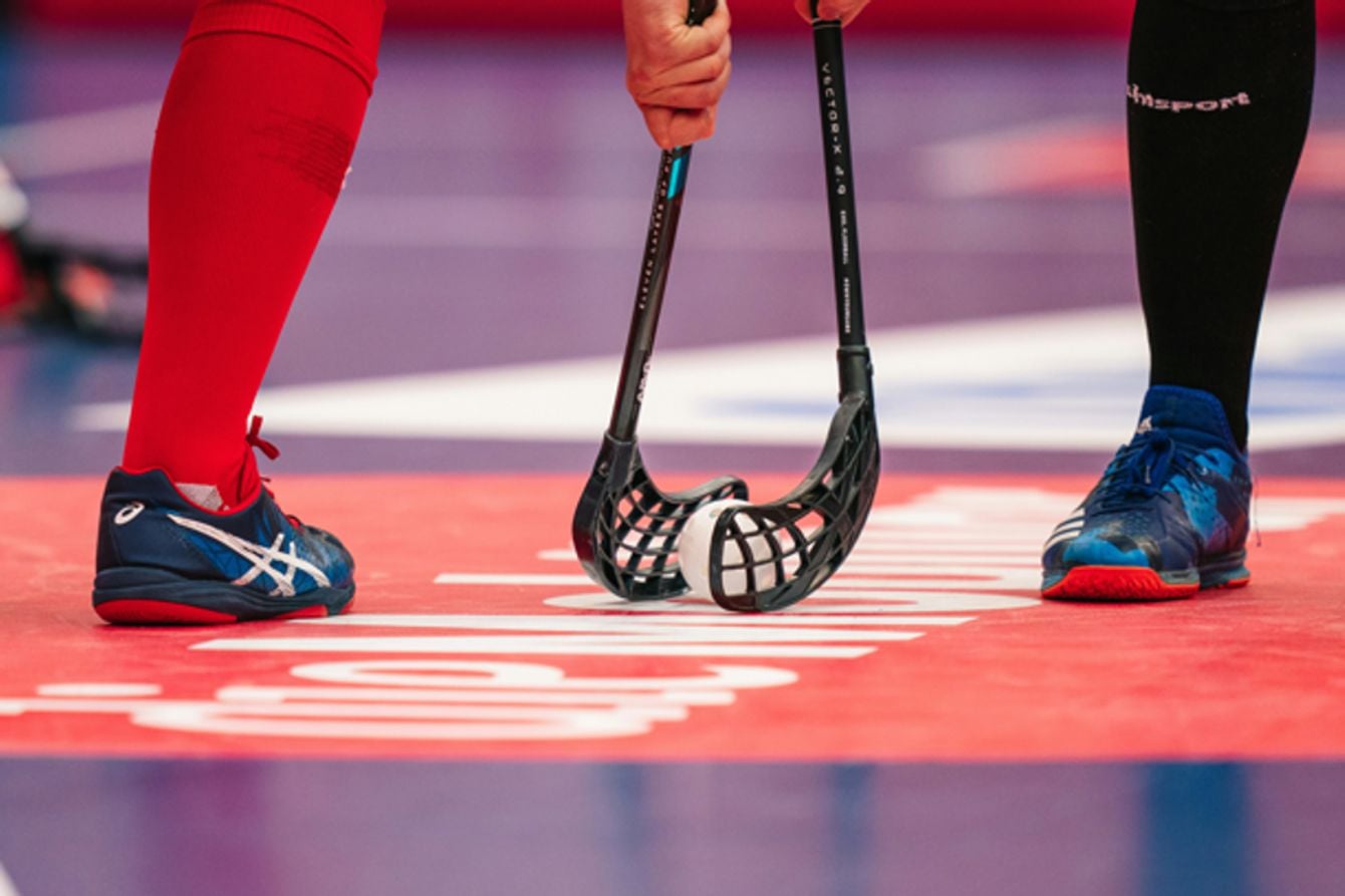
Since its foundation in the late 1960s in Sweden, floorball has taken off as a sport of its own and is played widely across the world. With fast-paced action and a smooth, rolling substitution rule, meaning play doesn't need to stop for substitutions to take place, the gameplay is fluid and results are unpredictable. As with all other top team sports, different teams wear different colors for a variety of reasons, primarily identification of other team members. But other approaches are becoming widespread, in floorball and the wider world of sports, where design and function meet to solidify the branding and identity of a given team.
What is floorball?
The game has its roots in bandy, which is similar except played on ice, itself a forerunner of modern ice hockey. The game is played by two sets of outfield players and two goalkeepers, with five outfield players per side. Similar but less physical than field hockey, the game involves using sticks to try to direct a plastic, holed ball into the opposing goal. Championed across Scandinavia in the late 60s and early 70s, the first rules were written down in 1981, and the International Floorball Federation was founded in 1986 to oversee the sport. The most important prize on the floorball calendar is the WFC.
The WFC events
This year (2026), the men’s World Floorball Championships (WFC) takes place in December, with the women’s competition following in 2027. Both events are being hosted by Finland, in the cities of Tampere and Turku, respectively. Emphasis has been put on the WFC’s visual identity, for example, the logos for the respective events are similar in design, and the primary focus is on nature and growth. The official slogan of the WFC is “Free of Limits”, with the core values of the event being expressed visually through the branding.
Two Similar Logos
This is the first time in the sport’s history that the men's and women's events have been held in the same country, and the logo expresses that difference, despite being almost identical in design. The logo is formed by bold outlines of a tree, designed by Juha Ollikainen, the Visual Producer at the Finnish Floorball Federation. She explains ‘the logo combines several elements. A tree grows from the earth, reaching towards the sky. Each branch represents an individual, and together the branches form a large, celebrating crowd.’

The men’s event logo features bold outlines, whereas the women’s one is rich and colourful. The logos, according to Ollikainen, ‘(visually) grow as the tournament progresses.’ Logos and branding can be easily incorporated into custom-designed sports apparel, from jerseys to training and leisurewear.
The importance of floorball jersey design
As with any team sport, the jersey design of a floorball team has to be instantly recognisable to other players. High-octane gameplay means that players must be able to identify teammates and opponents at a glance and react quickly under pressure. Therefore, all teams are fitted with quality, tailored designs from custom outlets, which are both visually engaging and breathable for added comfort on the field.
Whether or not the participating teams will adapt their kits to meet the core values expressed by Ollikainen and the wider WFC remains to be seen, but, as we’ll see, some of those ideals are becoming more commonplace in soccer jersey design.
Jersey design across sports
Given the number of options available to 3D design kits and custom uniforms, it's fair to say that producing jerseys doesn’t have to be a one-size-fits-all situation. Different sports require different approaches to design, although history and heritage are now being taken into account in some realms of sport. Soccer giant Ajax’s club strip this year is a good example, marking the 750th anniversary of the founding of the Dutch city of Amsterdam. The team’s third kit is beige, with blue and dark red accents. The beige is inspired by the oldest document referencing Amsterdam: the toll privilege granted in 1275.
A modern imagining of the oldest city seal is located on the inside collar, signifying Amsterdam’s rich history and continental importance. As well as these kinds of details, teams are leaning towards richer, earthier tones (especially for their third kits, which have often become an avenue for more creative endeavours than the first two).
Favorites for the championships
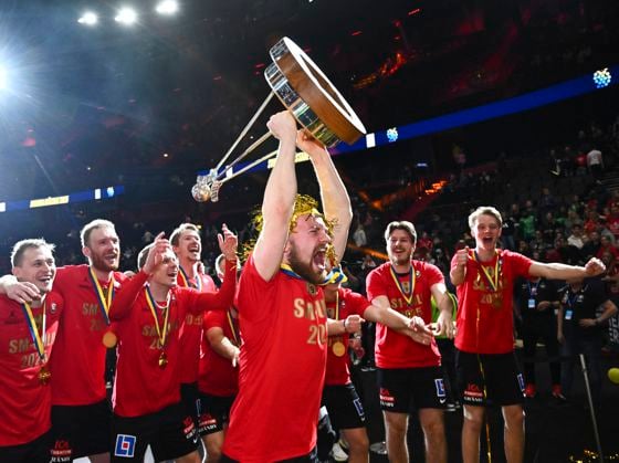
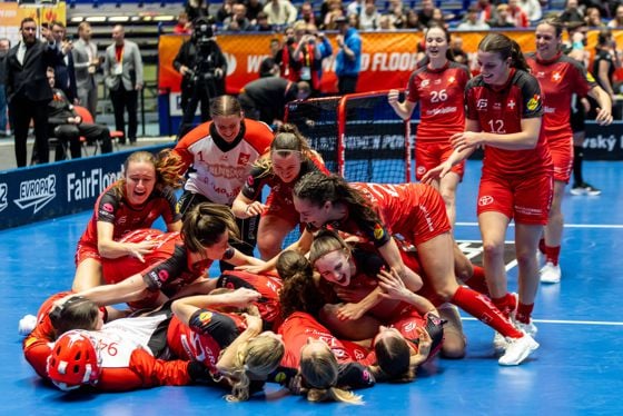
Traditionally a Scandinavian sport, floorball is dominated by Sweden and Finland, with the latter looking to secure back-to-back wins, this time with a home advantage. But there are many other nations with a shout, such as Czechia, which consistently challenge for floorball tournament meetings. Latvia and Sweden are also worth keeping an eye on, currently 4th and 5th in the men’s rankings. In the women’s game, the same trend applies. 2027 could see another victory for the Finns, though the other contenders, like title holders Switzerland, will be hot on their tails.
As we look forward to the premier floorball competition, it's worth mulling over the changing nature of kit design, logos, and branding, which will debut under the lights in Finland come this December. Tones used can be shaped by changing philosophies and approaches to branding, just as much as they are to on-field practicalities such as player recognition and team unity.
Image credits Title image: Unsplash / Claudio Schwarz; Image 2: IMAGO / TT; Image 3: freeoflimits.fi/ ; Image 4: Unsplash / Mads Eneqvist; Image 5: IMAGO / CTK Photo